Coursera
Enhance online learning experience and keep users engaged in learning systems
Tasks
Research
UX/UI Design
Prototyping
Usability Testing
Timeline
01/2023 - 04/2023
Overview
One of Coursera’s main struggles was to retain the current users and bring in new users into the platform. Thus I designed several solutions to encourage new users to start the course and reduce dropout rates, ultimately improving the user experience and increasing user engagement through collaborating with the Coursera team.
Problem
There’s 31-46% of users drop off between the first checkpoint and course completion. Non-traditional learners struggle to confidently navigate and adapt to the new online learning format, making it difficult for them to take their first steps successfully.
Learner Types
There’s three different types of learners I was able to identify through research and interview.
The Motivated: Learners that are highly likely to start and complete a course with little to no external intervention.
The Misfit: Learners enrolled in a course that does not fit their expectations or no longer relevant.
The Missing Link: Learners who are enrolled in the right course for them, but are lacking confidence or motivation.
Insight:
Findings from research data and user stories
70% of interviewed users identified Coursera's primary challenge as high drop-off rates. A deeper analysis uncovered user frustrations and insights, highlighting key opportunity areas and potential solutions to tackle the issue.
Concept Ideation Map
User Empathy
From the research data, I've created a persona focusing on the third user type: the missing link as it’s directly related to users hesitant to return to the course page to complete a course successfully.
How Might We leverage Athena’s community of learners to effectively support individuals and keep them motivated?
Current Existing Solution
1. Coursera users seek out study groups on external platforms like Discord and Telegram.
2. Difficulty finding questions that you may have (repeated questions)
3. Lack of granularity in the categorization of questions.
4. User has to leave the class to interact with the forum.
User Testing
We made modifications through several cycles of feedback, and made changes and improvements to the prototype to address the identified pain points and improve the user experience.
Additionally, conducted a second round of user testing to ensure that the changes have improved the user experience through a high-fidelity prototype.
Website Sitemap
Redesigned Solution
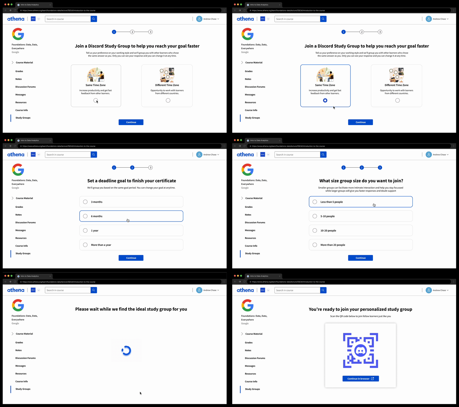
Study Group:
Learn together, grow together
Redesigned solution provides following benefits to the users:
1. Small group of learners progressing together to keep each other accountable
2. Provide motivation and emotional support to each other
3. Opportunity for networking
On your own, but never alone
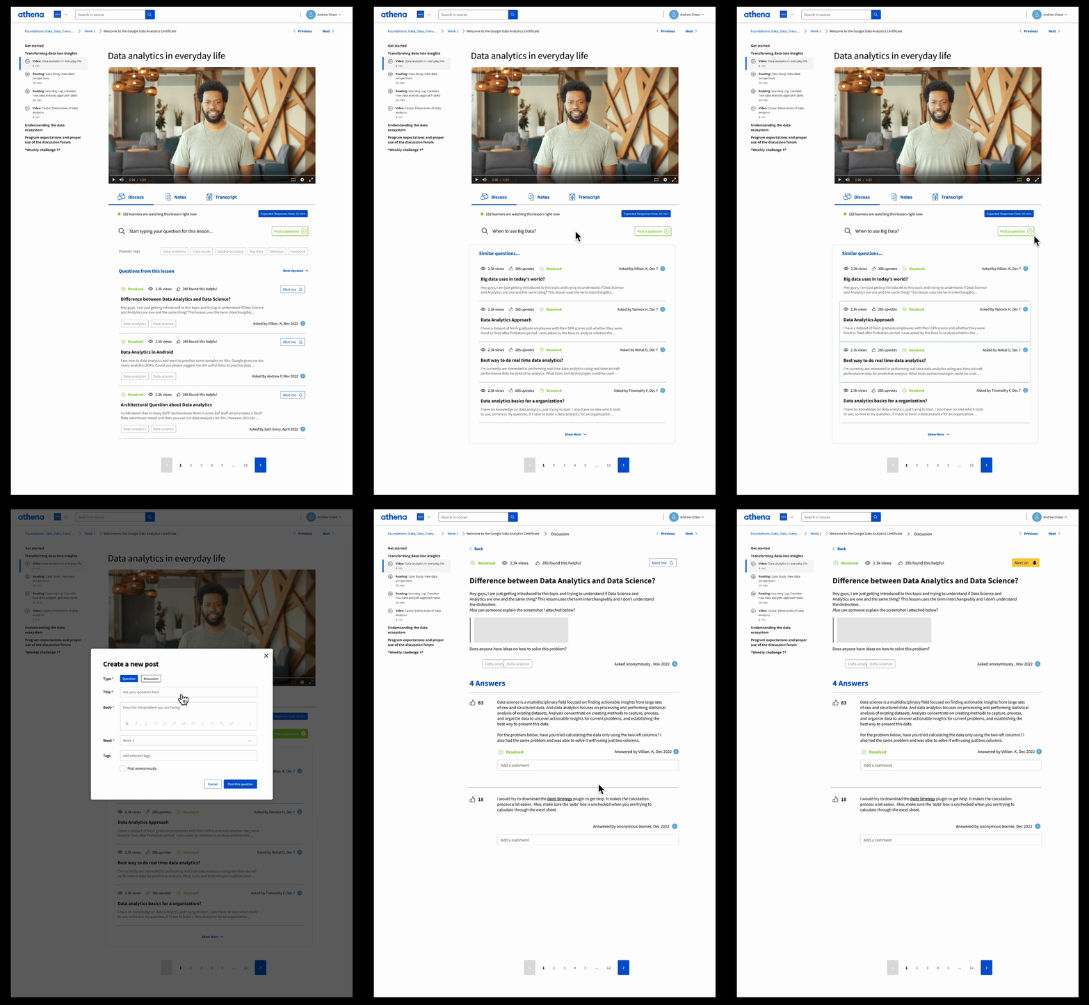
Forum:
Redesigned forum offers an engaged community of learners that support each other throughout the learning experience.
1. A place to discuss the specific lesson you are watching
2. Ask and resolve doubts as you encounter them
3. Switch easily between discussions, notes and transcripts
The project's ultimate achievement was elevating the user experience and driving higher platform engagement, resulting in a subscription growth of over 4,000 users within a month.
Impact
An onboarding tutorial for the course to make the users more comfortable and guidance. Exploring opportunities with gamification of the platform.
To be continued
UX: 'Seamless' and 'quick' aren't synonymous. Strive to create an experience that flows smoothly; don't simply eliminate steps.
Pivoting: Avoid committing to the initial idea; despite validating the opportunity, the initial solution may prove wrong.
User Testing: Everything you want feedback on should be present in the prototype. Hypotheticals diminish validity of feedback.


